Homelessness Analytics from Existing HMIS Data
We remodeled a county's existing but unusable HMIS data into a BigQuery-and-Tableau analytics platform that surfaces individual client journeys and program-level insight for tackling homelessness.

We first approached this Northern New York county to show them something we were proud of: a greenfield, Microsoft-based tech stack and a set of solid-waste analytics we had built for Lewis County’s solid waste department off the data in their comp-plan system. The pitch was simple. Would they want something similar?
Their answer reframed the entire engagement. They loved the idea of building out data-analytics capability, but they had a far more pressing need than waste metrics: homelessness in the county. What followed was a project that, in the end, came down not to collecting new data but to making sense of data they already had.
The challenge
The county was not short on homelessness data so much as short on data it could actually use. Like most jurisdictions, it had access to HMIS (Homeless Management Information System) records, but those records had two problems.
The first was completeness. HMIS captures a lot, but it does not capture everything. There is little to no information flowing in from stakeholders like police departments and precincts, even though they are very much part of the homelessness picture. We spent a substantial part of this engagement working through whether to address that gap by standing up a parallel data-collection system of the county’s own, and we went as far as demoing how such a system could work. Ultimately, for legal and other practical reasons, the decision was made not to collect new data and instead to rely on the HMIS data already available.
The second problem was the one that really mattered, and it was about shape, not volume. Raw HMIS data arrived as one record per logged interaction: a client ID, a location, and the program the client was admitted to or interacting with. Useful as a ledger of events, but close to worthless for the questions the county actually needed to answer.
Those questions were about narrative and trajectory. For a given client, when did they first enter the system, how often have they interacted with it, which programs have they used, and have they moved over time toward more stable forms of housing? And at the population level: on the night of June 1st, say, how many people were actively using a hotel-voucher program?
The answers were technically present in the data, but its incident-level structure made them nearly impossible to surface. To trace a single client’s journey you would have to filter to one client ID and manually sort by date to reconstruct the arc by hand.
In other words, this was never a data-collection problem. It was a data-modeling and data-visualization problem.
What we built
We stood up a brand-new, greenfield tech stack built around three tools: Google BigQuery, Fivetran, and Tableau. The county is Google-native across its other tooling, so BigQuery was the natural home for the warehouse.
The pipeline is deliberately simple where it touches people and automated everywhere else. Once a month, the county’s social-services department supplies an anonymized cut of the HMIS data into a Google Drive folder. From there, Fivetran uses an ELT pattern to pull the fresh data into BigQuery, and Tableau refreshes automatically on top of it.
There is no direct connection into HMIS itself, which would be nearly impossible to obtain, so this is the next best thing: one person drops one file, once a month, and the rest of the pipeline runs end to end without anyone touching it.
The real work happened once the raw data landed in BigQuery. We remodeled it from its incident grain onto a day-client-program grain: a row for every client, on every day, capturing whether they had an interaction, how many, and what kind of program those interactions related to.
That transformation fanned roughly a thousand raw HMIS rows out into a modeled dataset of around a quarter of a million records spanning at least five (and closer to ten) distinct programs. More importantly, it turned a pile of isolated events into something you could actually ask questions of, at both the individual and population level.
On top of that foundation we built a Tableau dashboard organized into three tabs, each focused on a distinct subject area:
- Client-level metrics: how many clients are being served on any given date, where they are on any given night, and similar point-in-time views of the served population.
- Program-level metrics: utilization by program rather than by unique client (a single client can be enrolled in several programs at once). This is the view a program lead goes to, filtering down to their own program to see how it is being used.
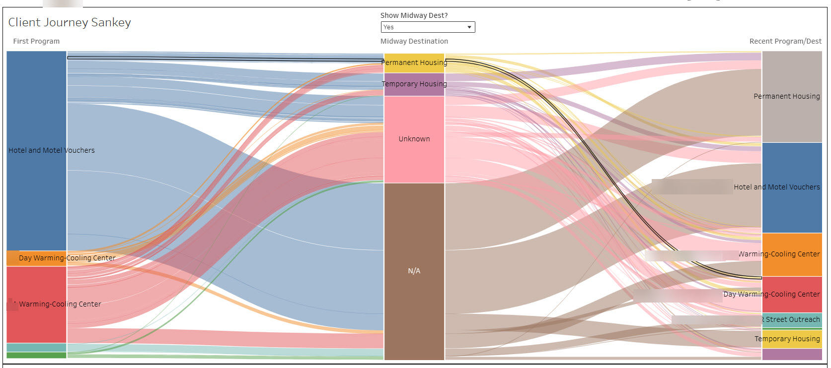
- Client-journey deep dive: the narrative tab. It includes a table sorted by number of unique program interactions, so you can click into a client who has touched many programs and drill into their individual story and trajectory. It is also home to a Sankey diagram we built to visualize how clients flow between programs and toward more stable housing over time.
The full engagement ran about six months. Roughly four of those were spent in discussion and discovery, working through how to source the data and whether to build a collection system of the county’s own, and roughly two were spent building the dashboard and running it through UAT cycles.
The outcome
We delivered the county a fully remodeled, fully visualized cut of its own HMIS data. Questions that were previously impractical to impossible are now a filter or a click away: how many people were on a given program on a given night, or what one client’s path through the system has looked like over months and years. The pipeline keeps it current automatically, with a single monthly file drop as the only manual touchpoint.
The clearest signal of impact is how the work is being used. The county administrator, deputy county administrator, and individual program and department heads have been exporting visuals straight out of these Tableau dashboards and dropping them into presentations that go directly to legislators. The platform is not just an internal reporting tool. It has informed decision-making at the legislative level.
And because what we really delivered was a data foundation rather than a single report, its usefulness does not stop at homelessness. The same stack now positions the county to build out a wide range of future analytics as new use cases emerge across departments.